Sites Overview
What are Sites?
Sites give you the ability to create client-facing websites within GrowthFlow. Create that perfect home page for your business. Whip up a landing page to capture more leads. The possibilities are endless.
Within GrowthFlow, we have two types of Site Builders; while they are similar they do have different functionality. Let’s review each type of Site.
Funnels - In general, funnels have a very direct sequence of pages, which is why we offer split testing on funnels only. Funnels are a step-by-step series of web pages, generally used for a specific purpose like capturing leads or booking appointments. site
Websites - A place to build web pages for any use case, such as a homepage for your business. There is generally no path of progression that contacts are led through, which is why we do not offer split testing on websites.
Though you can use Websites for much the same reasons as funnels, websites are different in some small ways.
Which one should I choose? Funnels or Websites?
In all but a few ways, Funnels and Websites are the same. They both house a group of webpages and they can be used for various purposes despite which one you choose. What matters is if you want to use a Split Testing feature on a web page and the page views UI.
The main differences between funnels and websites?
Split Testing in Funnels - You can only split test on Funnels. Split Testing in funnels is when you create a variation of a page to see which is better.
eCommerce (Online Store)- Only websites can create and utilize the eCommerce (Online Store) feature.
Page View UI - There are different page view UI depending on if you are in the funnel or website views.

Getting Started with Site Templates
When you go to create a new site, you will have the option to choose from hundreds of templates. Once you have selected a template, you can edit any or all of the parts when you have selected it. We encourage you to check them all out!

After selecting the template it will load the template. If you aren’t already, navigate into one of the pages by clicking the “Edit” page to open up the site builder to edit a specific page.
Site Builder Overview
The same functionality and hierarchy of elements exist in both the Funnel and Site Builder. Let's hop in and check out our Site Builder and how you use it to create sites.
Site Builder Navigation Bar
The site builder navigation bar lives at the top of the builder and allows you to toggle between all of the various features. We will review each of these tabs below.

Adding a New Element
Rows and columns are the building blocks of your site and are used to house elements. To add an element, like an image, you need at least one section, one row, and one column. Then you will be prompted to add an element. There are many elements, each element is unique.
Now let’s add an element to your site. In the top right of your site editor, you can select "add element" to see your options for what objects can be added to your site. Once you have chosen the element you would like to add, click and drag the element to the area you prefer.

Understanding Element Nesting
Every element on a webpage requires a section. Within this section, you need to have at least one row. This row needs to have at least one column. Adding all three of these (Section > Column > Row) we are then able to add an element from the "+Add Element" bar.
From largest to smallest, we have:
Sections (Green) > Rows (Blue) > Columns (Pink) > Elements (Orange)
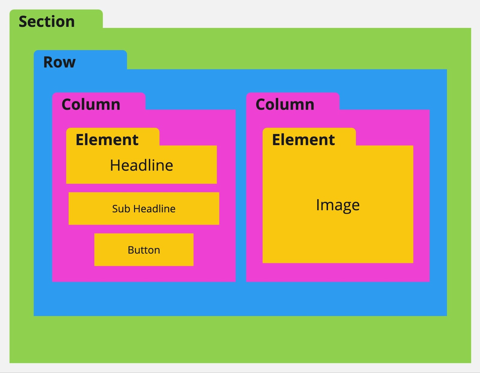
About sections, rows, and columns...
You cannot add a section within a section. Nor can you add a Row within a row or a column within a column. You also cannot add an element within an element.
You can add multiple rows into a section. Within a row, you can add multiple columns. Within a column, you can add multiple elements.
You must have at least one section, one row, and one column to add an element.
Element Settings
To edit a specific section, row, column, or element, hover over the element then click on the gear setting icon that appears. In addition, clicking on any part of the element will also automatically open the pop-out settings menu on the right.
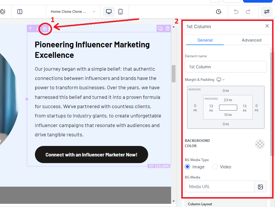
Within these settings, you can add padding, margin, change visibility, and much more. Also, note the "General" and Advanced Tabs which offer more settings you can use to make your site great.
Padding and Margin
When you want to move or put space between an element on your webpage - you are going to be adjusting the Padding or Margin. This is done within the object settings, clicking on the object will pop out this settings menu on the right.
Padding - This will add space WITHIN a section, row, column, or element. Padding will add space from the outside of the object inward.
Margin - This will add distance OUTSIDE of a section, row, column, or element. Giving space between other objects.
Moving an Element
You can move an object by using the up or down arrows seen when hovering over the object. This will shift the element up or down based on the elements around it. In addition, you can move an object by hovering over the object, and then clicking and holding the move icon. This will let you move the object. Release the held click to drop it into its new place.

Option 1: Up/Down Arrows – will move the object up or down based on the objects around it.
Option 2: Click and Drag – will allow you to click and drag it where you want it.
Cloning an Element
Hovering over any object will give you the ability to clone that object and everything within it. All settings and objects within the cloned section will be duplicated and then added below. This is great when you have a format or object that you want to use again or somewhere else on the site page.

Deleting an Element
If you need to delete or remove an object, hover over the object then select the trash can symbol. This will delete the object. You can use the Undo/Redo to add it back if you need to.

Layers
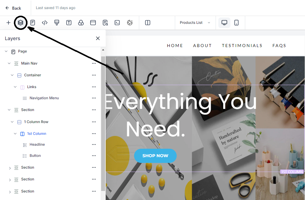
Layers help you view all of the various objects and how they are nested within the Website Object Hierarchy. Helpful when you have misplaced an object or hidden it from both mobile and desktop view.
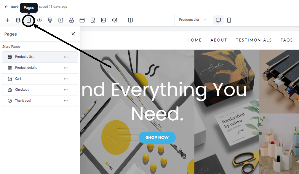
Pages
View and navigate to other web pages within your Funnel or Website from the pages tab. Giving you the ability to quickly move between web pages when editing multiple web pages. You can access this tab from both the right and middle site builder navigation bar.
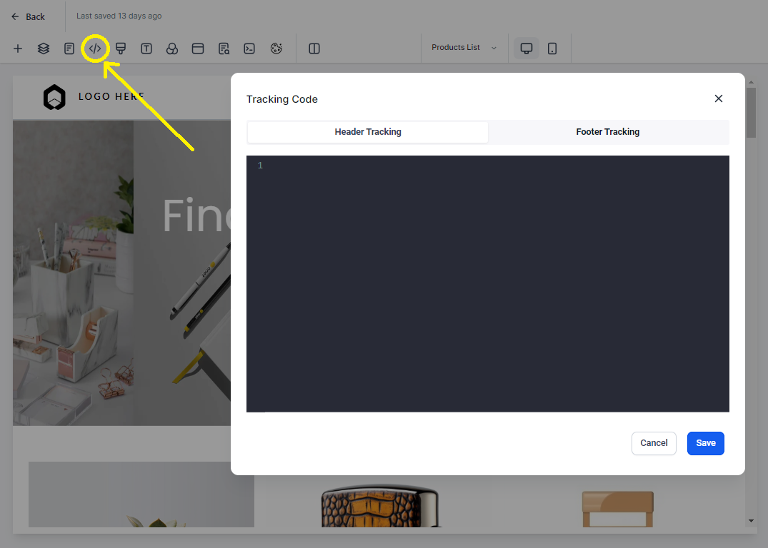
Tracking Code
In the event you would like to add a tracking code to the header or footer of your webpage, you can do so from this Tracking Code page.
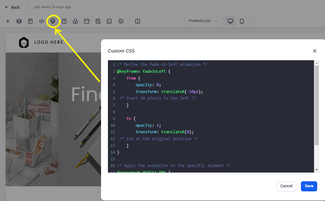
Custom CSS
When you want to add custom CSS to your website to your website, you can from the custom CSS tab. You can consult a developer for how to use and create a code for your unique needs.
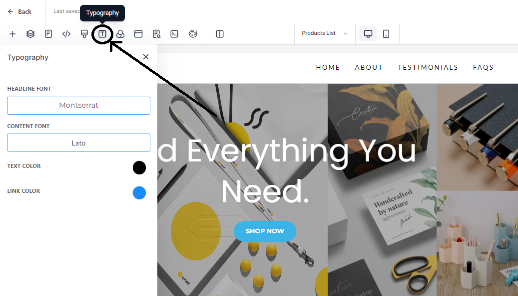
Typography
You can change the default font for your webpage headlines and content as well as your text and link colors within the typography.
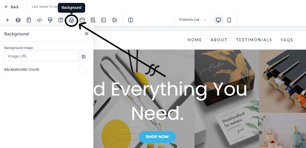
Background
To change the default background image or background color of your webpage you can select the Background tab. This will add a background behind your sections. If you have a background image or color set on a section, row, column, or element, it will be behind this.
Pop Up Settings
Most users dislike pop-ups, but the sad fact is that they still convert rather well, despite their bad rap. When you want to add a popup, you can do so from the Pop Up. After selecting it, you will use the pop-out setting menu on the right to edit the properties.
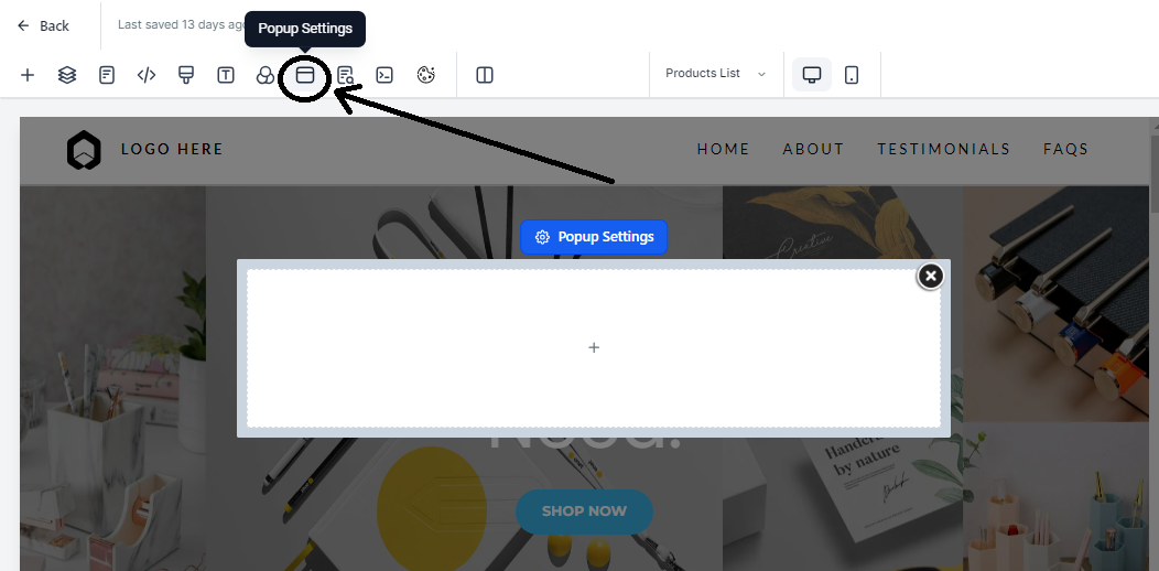
You can show a pop-up by adding a button and then have the button action deploy the pop-up. You can also use the pop-up settings to “Show Popup on” Exit or time delays - select the popup then see the settings on the right-hand side.
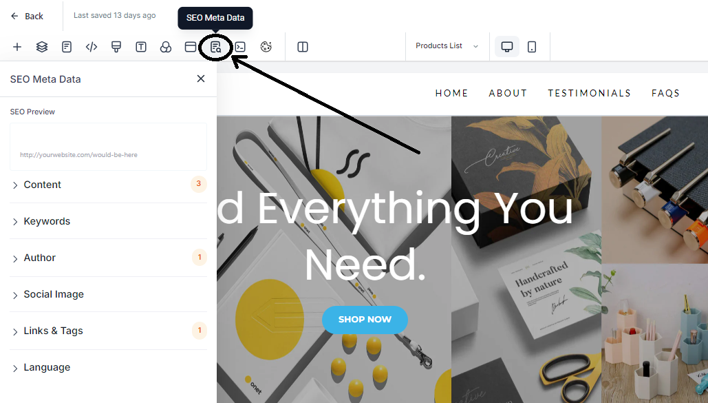
SEO Meta Data
Here, you can edit the SEO metadata, this will show up in search engine results when searched. In addition, it will show in the tab settings of your browser, when you share your site link and more. It might seem small but having your SEO settings set up is important - it helps search engines find your site and when sharing a link, it helps users trust the link.
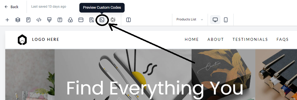
Preview Custom Code
If you have custom code on your site, providing it was installed successfully, this button loads this custom code so you can see it within the builder. Another option is previewing the page. If your custom code is not working as planned, please consult a developer.
2 Column Mode Versus Auto Mode
When you are using the builder you can choose to have the right popout lay over top of the webpage or you can set it to two-column mode, which will push the webpage into two columns. The first column is the webpage, the 2nd is the settings tag that popout on the right.

Undo/Redo
When you open and begin editing your site, you may find the need to undo a change you made. You can undo or redo your actions at the top right of your site builder navigation bar.

*This will only work for your current session, meaning when you reload or leave the page, you may not be able to undo or redo it as a new session will begin. The versions, outlined below, are great for restoring previous versions of the site.
Versions, Preview, Save, and Publish
In the top right-hand side of your site builder, you will locate versions, preview, and save buttons. Let’s go through each of them below.
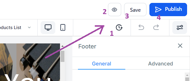
Versions - selecting versions will take you to previously saved versions of your site. Helpful when you want to view or revert previously saved versions of your site.
Preview - create a preview version of your site page for you to see as if it is a live site. Great for testing and seeing what your recent edits look like for a live visitor.
Save - you can click the save button to save an unpublished version of your site. This same version will be overwritten after every save. This is different from the published live version of your site. This means your site visiting will not see any of the changes made on this version until they are published.
Publish - Publishing will activate the current saved version of your site to be posted live to the internet. Now site viewer will see the most recent published version of your site.
Editing the Mobile View of Your Site
Every site builder has both a mobile and desktop view. Unless you edit an object, the desktop and mobile views will be identical. When you go to review your mobile view of your site, you will likely find some aspects of your site you wish to change or adjust for your mobile viewers. This makes sense, mobile and desktop screens are different sizes. So we will need to adjust how the mobile view looks to best suit mobile viewers. Let’s learn how to edit your mobile view below.
Mobile Mode
At the top of your editor, you will see a button for Desktop Mode and another called Mobile Mode. Selecting the “Mobile Mode” will toggle to the mobile view editor of your site.

All Website objects by default are mobile and desktop visible. However, you can change this, which will help greatly in some circumstances.
Changing Object Visibility to Mobile/Desktop Only
More than likely, you will find you need to create a unique section, row, column, or element for mobile view only. You can edit the visibility of your elements with the visibility setting. Select any object, go to settings, then advanced settings. This is very helpful when optimizing the look and feel of your desktop or mobile views for your site.
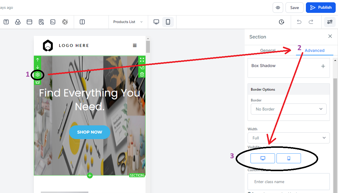
After toggling, you will only be able to see the elements based on how you toggle them. So if you removed Desktop, you would only see the element on the mobile editor view on the live mobile view of a website.
Mobile Responsiveness Settings
Within your object settings, you will see mobile responsive toggles that allow you to edit an object's settings unique to mobile or desktop. For example, the image below shows an image element alignment settings. This means you can change how this element looks on the desktop view, then toggle to the mobile view and edit the mobile settings to be unique from the desktop view.
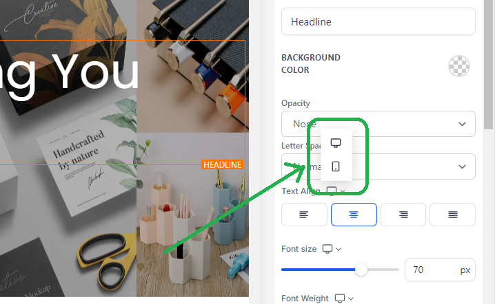
You will find mobile responsive settings like this on several object settings. We are always working to add in more.
Pro Tips for Mobile Mode Editing
There are a number of of tips and tricks to learn when editing your mobile site, let’s check out a few:
Finish Desktop Mode First
More often than not, completing a full version of your desktop view of your site makes it easier to edit your mobile view. So get that desktop view looking stellar THEN start working on your mobile view after your desktop view is the way you like it.
Mobile Navigation Menus
If you have a site navigation menu, create a Global Section with Mobile-only visibility. This can be added to the mobile version of each of your pages for a clean and consistent look. You can do the same for the Desktop Navigation menu.
Duplicate an Object and Change Visibility
If you cannot get a section or object to look good on mobile without editing the desktop view, create a mobile-specific section. You can do this easily with the “duplicate” function. Which will create a copy of the object. Then you can change the visibility of one to desktop only and the new one to mobile only. Now we can edit the mobile one without messing up the desktop. This is great for images.
Learn how to see the Mobile View of your Site on Your Desktop
Did you know… you can see the mobile view of your site from your computer?
Site Settings & Publishing
Now that your site is built, let's review the backend settings of our site. Let’s walk through each of the backend site settings together.
Site Pages/Steps
This is where all of the pages or steps of your site live. You can edit or preview a page from here. We land here before entering into the Site Builder. Upon exiting the Site Builder, we also land here.

Attaching a Product to Your Site Page (Order Forms)
To use order forms on your site, you must attach a product you have created in GrowthFlow to your specific page. Products need to be added to the page a viewer will use to checkout and purchase your product.
On Websites, you click the three dots on the top right of the page, then select products. For funnels, you select the step, then select products in the top right tab.

After arriving on the Products tab for a page, we will need to add the GrowthFlow Product. If one isn’t created in your Sub-Account already, you will need to create one. You can learn more about our
Site Stats
Stats will give you insights into the number of page views and opt-ins you have had on your site. In addition, you can see the number of sales and even earnings. Learn more about stats and what they count here: Understanding Stats.
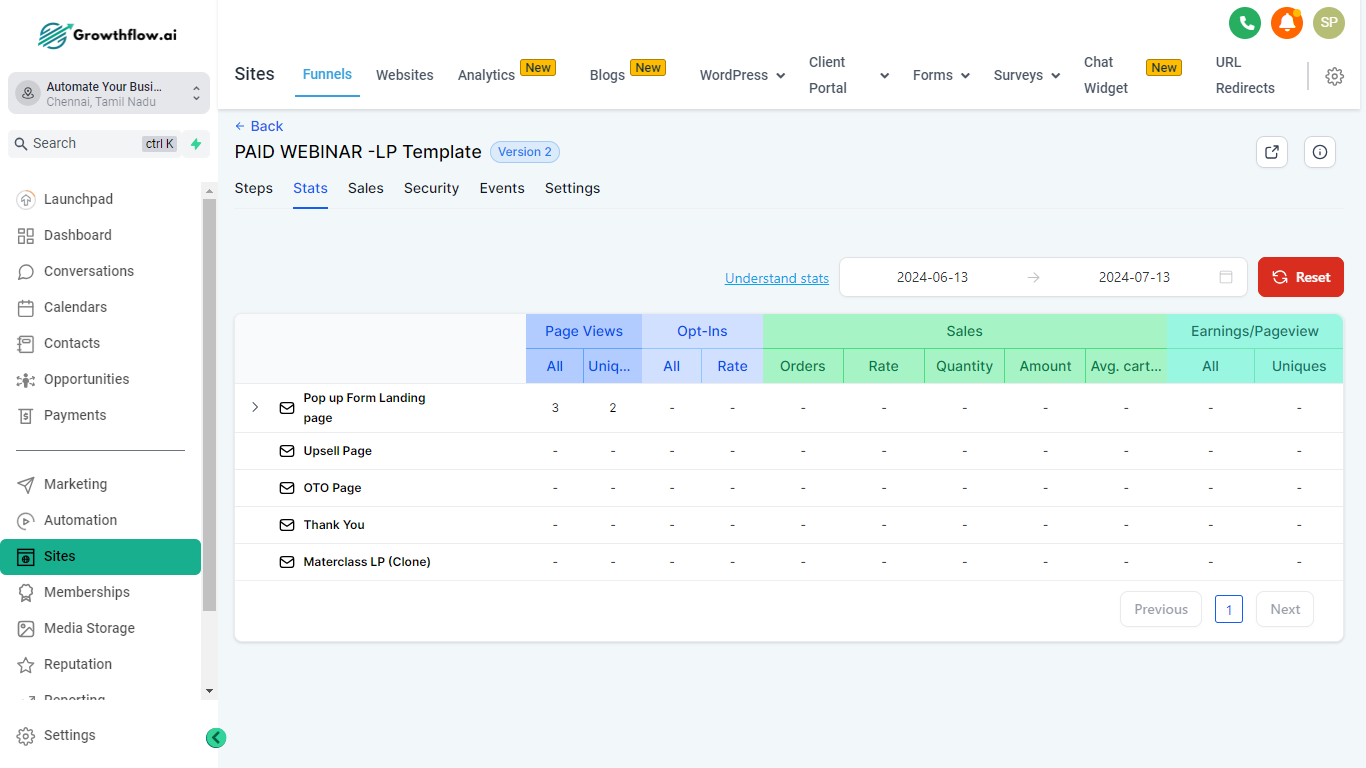
Site Sales
Reveals each transaction that has occurred on your sites. For Version 2 sites, we have moved this to the Payments Tab > then select Orders and Transactions tabs.
Site Settings
Site settings give you the ability to attach your domain, update the default path, add a favicon, and more! Let’s unpack each of these together.
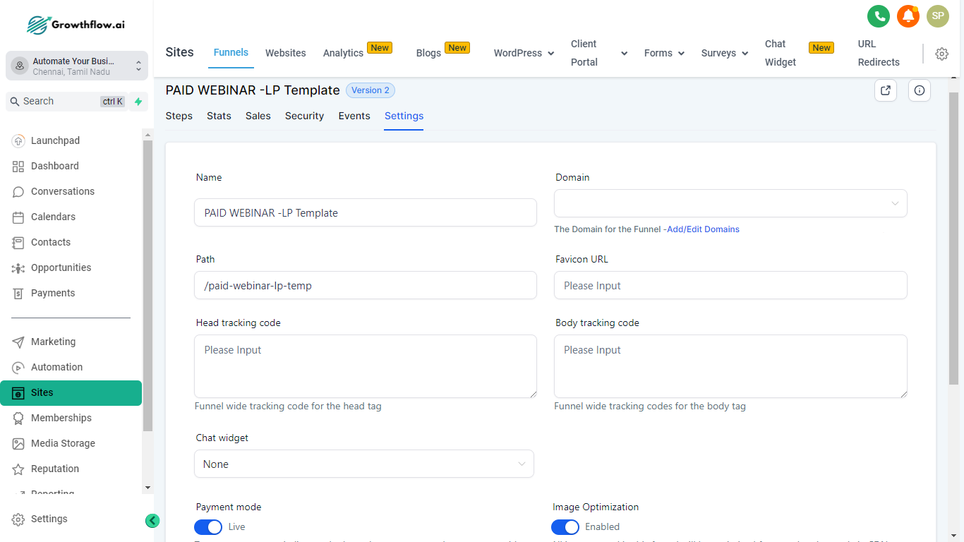
Name - is the name you give your site. This does not appear to your customer, this is for internal use only.
Domain - is the domain you choose to assign to your website. For example: app.growthflow.com is our domain we attach to our Site. Without a domain, people will be unable to visit your site. Unless you use a preview link, but these are uncustomizable and not recommended.
Path - is the default path or extension for your site. It looks like this when used, app.growthflow.ai/features → the “/features” is the path. Each page on a funnel or website will have its own path, and no two pages can be directed to the same path.
Favicon - is the small icon that appears at the top of your browser tabs when someone opens and views your site. You must add a shareable image URL here, after being added, it will load the favicon for all of the pages of your site. Learn how to (LINK TO FAQ).
Head tracking code - installs a site-wide tracking code into the header.
Body tracking code - installs a site-wide tracking code into the body.
Payment mode - if you have products attached to your site, then you can automatically switch your payment mode to test or live. Test, allows you to use to fill out the form and then run a test. Great for testing your funnel. However, as you get closer to launch, a live purchase is encouraged - you can always refund yourself.
Image Optimization - will automatically adjust your images to load faster. It is on by default and is generally not recommended to disable it as faster loading times result in a superior page experience for viewers.
Optimize Javascript - Javascript is custom code you can install to run special operations on your sites. Oftentimes, JavaScript can impact loading speeds, enabling this will assist in page loading. The External Javascript will be lazy hydrated for better page load performance.
GDPR Complaint Fonts - depending on your legal needs, GDPR complaint fonts can be enabled, removing all of the fonts, so your site can work to become more compliant with laws and regulations. Always consult a lawyer to ensure you are fully compliant.
Chat Widget - Your chat widget can be customized and set up under Sites > Chat Widget. Enabling this will deploy this chat widget to all of your websites. To deploy on specific webpages, keep this disabled then copy the code to the specific pages you want the widget on. Learn more about your chat widget here:
Publishing/Page Settings
To change the name of a step or site as well as the path or extension… In the site builder, you can click the three dots then select settings. Within the funnels, you select the funnel step then select the “Publishing” tab.

From here you can edit the step/site name as well as the path. The path for your page/site goes at the end of a URL. For example: app.growthflow.ai/features → the “/features” is the path. You can set these, otherwise, we will provide a random one. If the path already exists or is being used on your domain, it will add numbers as you cannot have repeat paths.
FAQs
What are Global Sections?
Global sections are saved sections that you can use across multiple pages. They are unique in that you can use the same section across multiple pages. Further, making any changes to a global section, after saving, will automatically update it to all pages the Global Section is used on. A great example of a scenario to use a global section would be the Header/Footer of your website. Using a Global section as a footer or header enables you to have the same header across all of your pages.
All we need to do is have a section we like, such as a header for our page, then hover over the object, click the Save Icon, name it, select “Global Section,” then click Save. Now we can add this same global section to all of our pages.
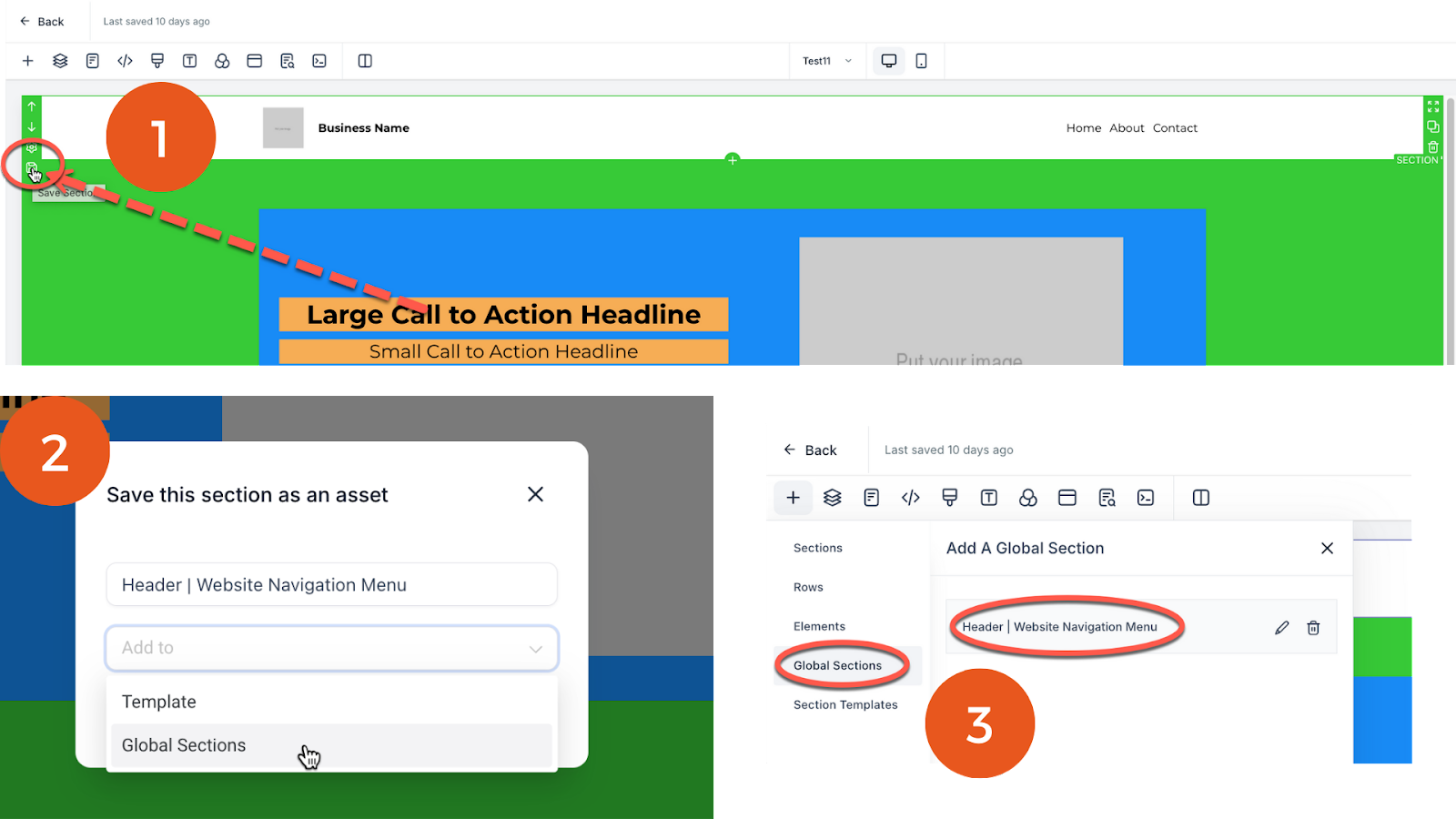
Remember, any changes to this Global section, after saving, will update this section in all of the pages it was used. Further, global sections are not automatically placed, you must add them.
To add a Global section, click the “+Add Element” Icon in the top right of your builder. Then select > Global Section > Select your global section.
What are Template Sections?
Similar to a Global Section (see above), a Template Section can be saved and then added later within the same webpage or another webpage. Changes made to these sections saved to the Template Section in use will not update the templates or other places the template was added.
What Are Funnels?
The term funnel in marketing means a series of websites used to capture leads. Funnels have “steps” that allow you to visualize a series of websites that a potential customer will visit. For example, in a booking funnel, I might have 3 Funnel Steps.
Step 1: Landing Page - where you can offer something for contacts to download in exchange for their contact information.
Step 2: Booking Page - After a contact fills out a form, you will want to thank them but then schedule a call with them. So you have your booking calendar on this step.
Step 3: Thank you Booking Page - After a client booked the call, they will land on this page, showing them the next steps and thanking them for booking.
Funnels usually serve a specific purpose, like offering a lead magnet or booking an appointment. There are many use cases for creating funnels. Whatever the reason, Funnels are a useful way to create a series of websites that contacts navigate through.
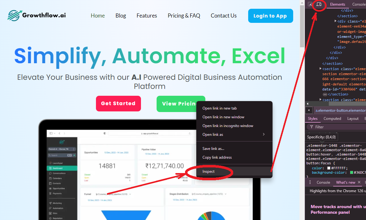
How to See the Mobile View of a Website on your Desktop?
When editing your site, you may find you want to see the mobile view of your website. Did you know you can see the mobile view of any website on your desktop? Simply right click on the loaded webpage, click inspect, then toggle the view from desktop to mobile. See the red arrow and the images below.
How do I upload and get a shareable image link in GrowthFlow?
To load an image, you must either upload your image to GrowthFlow or provide another shareable link. You can do this in Google and other areas, but let’s review how to do this in GrowthFlow.
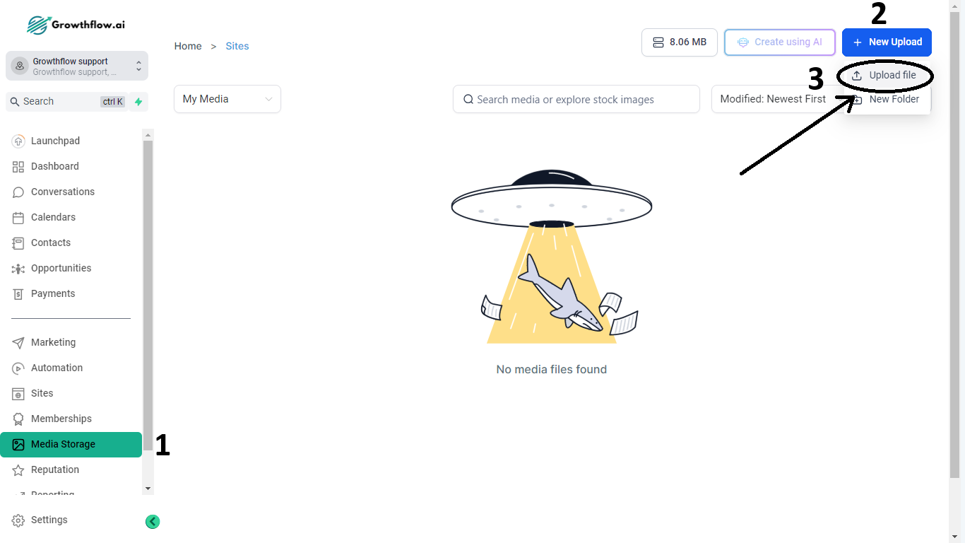
Within a Sub-Account go to Settings > then Media. Then select "Upload File" in the top right-hand corner of the media library.
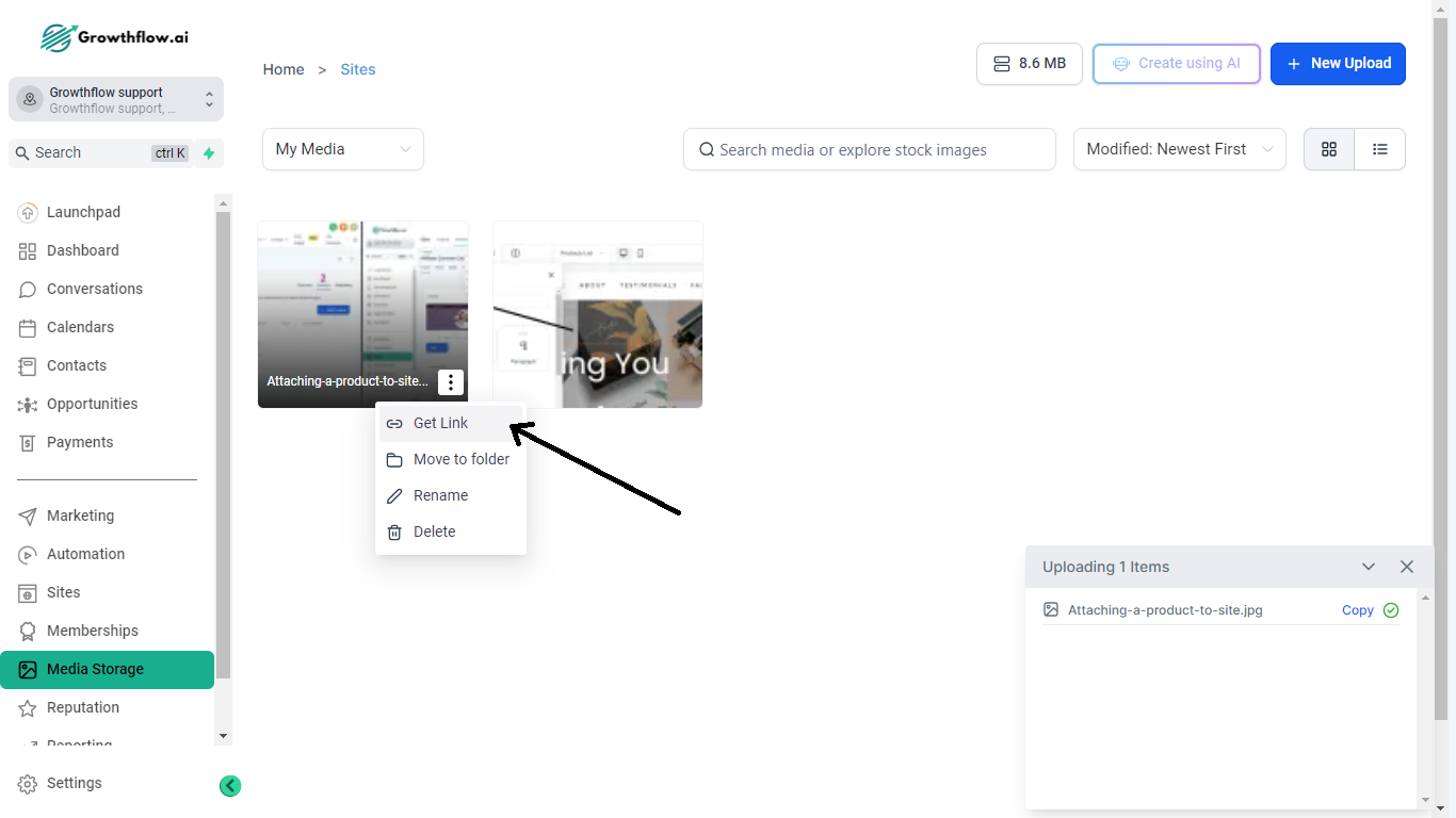
After successfully uploading the image, you can right-click on the image to copy the link to it. Use this link when a media-shareable URL is required. For example, within Site Settings, the Favicon requires a shareable media URL. You paste this newly uploaded image URL you have there so your favicon will load.
